
The Wrong Way Around
An isobaric acoustic prediction is a critically important tool that allows a sound system designer to predict and evaluate how well a sound system covers the audience area. Designers and engineers can see a “pressure map” or “heat map” of the system coverage at a particular frequency range.
So what exactly are we looking at? It’s right there in the name: “isobaric” = ‘same pressure:’ regions of the same color on the plot are the same sound pressure level (SPL) range, within that frequency range. A 3 dB range (+/- 1.5 dB) is common, but be sure to double check the plot information for the indicated SPL tolerance.
We must also be mindful of which frequency range is being displayed by the prediction. Some predictions are broadband with some form of weighting (Z, A or C), but I find these not particularly helpful from a design perspective because there are a lot of different frequency distributions that can create the same broadband SPL. That is to say that with a broadband prediction, regions that are the same color are not necessarily experiencing the same tonal response from the system. To get an accurate picture, we have to get more granular.
By viewing the SPL of a particular octave or third-octave frequency band, we can get a clear picture of how that frequency range behaves over the space. In Figure 1, we see two different design approaches for the same typical arena venue, predicted at 2.5 kHz (1 octave wide in 3 dB color bars).
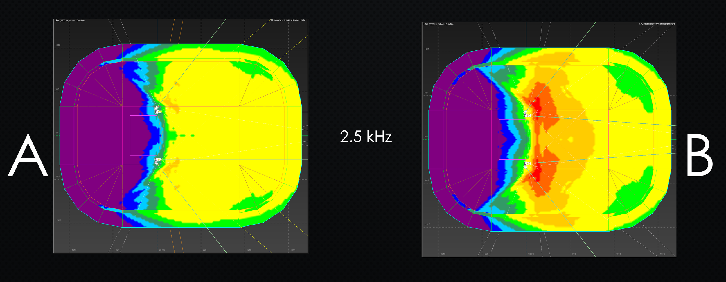
FIGURE 1 - Predictions of 2 designs for an arena venue, 2.5 kHz, 1 oct, 3 dB / color
Figure 1A (left) shows a design that features quite consistent high frequency coverage through the entire sold audience area, while 1B (right) shows a design with 6 to 9 dB of level drop from front to back in the same 2.5 kHz range. Which design is likely to result in a more consistent listening experience across the coverage area? When I ask this question in my presentations, the attendees – usually all professional audio engineers – overwhelmingly vote for the more visibly uniform design (1A). Seems obvious, doesn’t it?
If you smell a rat, you’re onto something. Now that we’ve examined the critical hi-mid frequency range, let’s expand our investigation to the low-mid range – let’s say, 250 Hz (Figure 2).
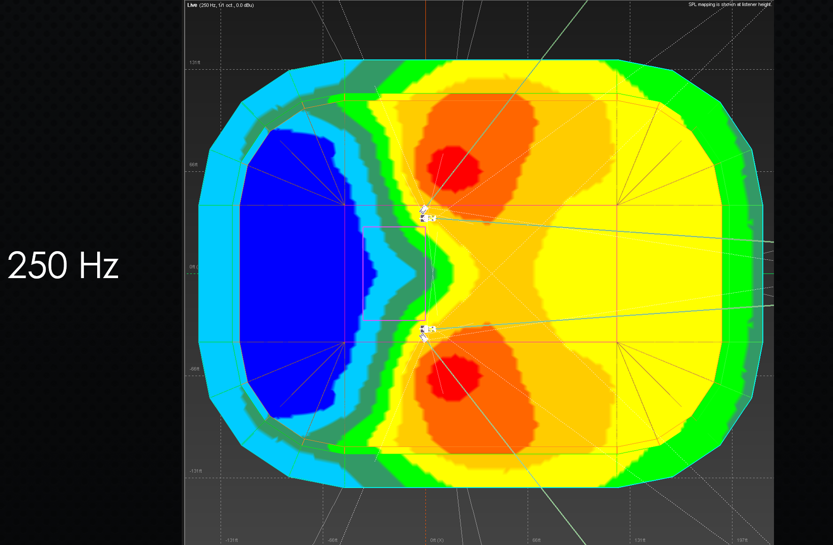
FIGURE 2
At low and low mid, the level drop from front to back along the coverage area is primarily determined by line length, and although some beamsteering technologies can buy us a bit of leeway here, we are largely at the mercy of the math.
So now, keeping in mind this naturally-occurring level drop from front to back in lows and low-mid range, let’s revisit the predictions we saw in Figure 1.
The design strategy shown in1A, on the left of the graphic, indicates a more or less constant high frequency response over the space (minimal level variance), in contrast to the higher variance at the bottom half the spectrum. This means that if the tonal balance is being determined at mix position – midway into the house – then moving forward from that point yields a more LF-heavy listening experience, while moving towards the rear of the audience area means the lows and low-mids fall away while the HF doesn’t, and the show sounds brittle, thin, and unsupported in the rear.
This is an important, if unexpected, point: This design approach creates what looks like very even coverage on the client-facing prediction, but actually results in a notably uneven tonal coverage, with the balance of the mix varying substantially across the listening area.
The design shown on the right (Figure 1B) takes a different approach: the high frequency falls off naturally, at a similar rate as the low and low-mid. This means that the entire spectrum drops together. We still have level variance, of course, but this time the tonality of the mix is maintained across the entire coverage area – the mix still sounds like the mix. Despite looking markedly more uneven on the prediction, this design is substantially more even from the standpoint of a listener.
If we view the 250 Hz and the 2.5 kHz predictions together (Figure 3), we can clearly see that the second design strategy (controlled HF level drop) is a better match for the front to back 250 Hz loss.
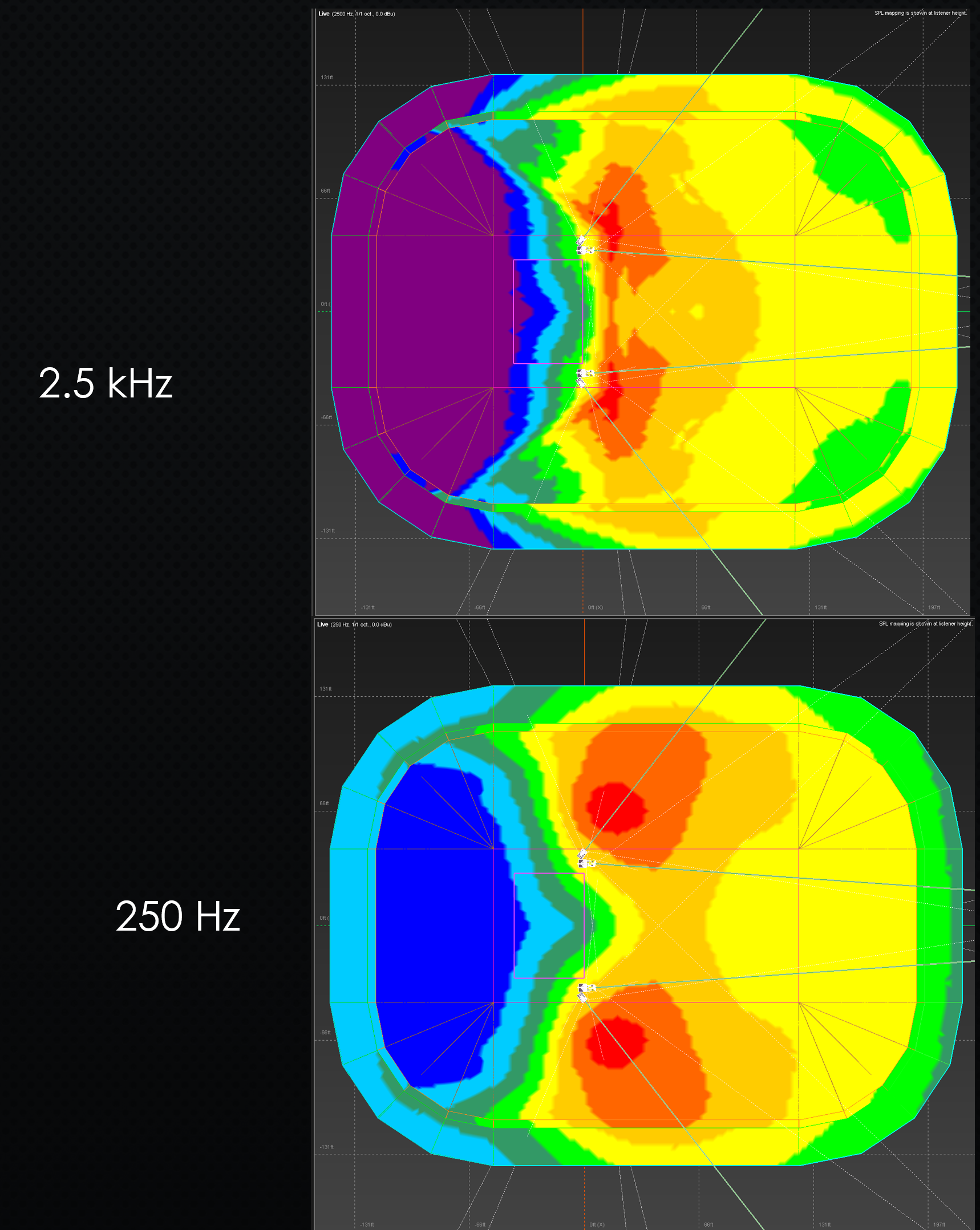
FIGURE 3
Of course, an experienced systems designer has an inherent understanding of this behavior, but they are coming at it with a ton of context and knowledge that we can’t expect from a typical client. And it’s completely intuitive to look at the more visually even prediction (1A) and think that that translates to a more consistent listening experience across the space. And despite being completely intuitive, it’s also the wrong answer in this case.
Once I show Figure 3 to the same room full of engineers who all voted for the more constant HF coverage at first, they change their vote. Context is everything.
All of this illustrates a glaring mismatch between the audience’s listening experiences and the prediction tools we use to help shape those experiences. The prediction shows us the distribution of a single frequency range over the entire space, while each audience member experiences the converse – the entire tonal response of the system at a single location. The prediction doesn’t inherently represent a human listening experience – it’s orthogonal to it. There are some conclusions that we can draw about one via the other, but we have to be careful, as the correlation is not as direct as it seems.
This means we have a little professional stewardship to apply when we discuss prediction plots with clients who are not deeply knowledge about sound system design. When they ask to review predictions, we need to provide them with the proper context to interpret what they’re seeking, steer them away from the idea that the “paint by numbers” yellow-everywhere design is the most uniform one, and help them understand that a tonally uniform design doesn’t look so uniform on a heatmap.